During my second shoot I focused on taking shots with showed a clear variation in distance, using a range of mise en scene which effectively worked in the images shot and were relevant to the indie/alternative genre. From the constructive feedback which I received from my peers I decided to use two more female models who would represent a duo band, this would then resemble the range of artists who display on my magazine. I decided to do some of the photos in the white room with ideal lighting equipment whilst I shot others outside in front of trees, brick walls and windows. I took inspiration on some of the images from previous band staged photos like the poses on the 1, 4 and 9th image.
These are my favorite photos from the first test shoot which I took landscape. I think that the overall style and design of the images create a professional look which would work well in my music magazine. The models which I have used portray a realistic young indie/alternative band who produce some rock songs. I made sure they were all of a similar height and wore suitable clothes which worked well together. I think the colors and designs effectively combine well to produce an image which can easily be identified as a three band members. I will use of these as my main front cover photo.
I also took some individual self portrait shots during the shoot. These include two model members of the band which I thought would be relevant in other parts of the magazine including the contents and double page spread.
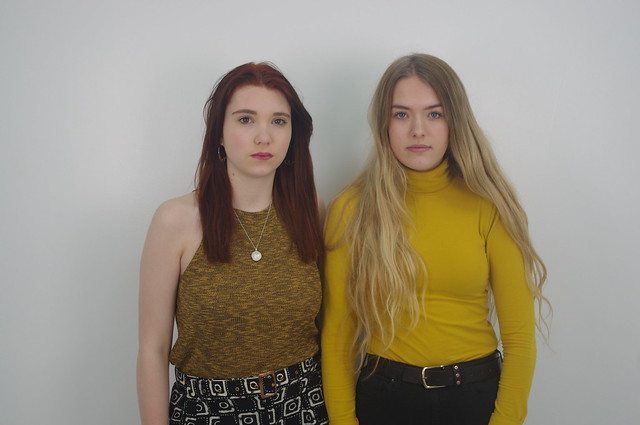
Finally I decided to take some photos of the two girl model band members so that I had a range of different combinations of photos to use when creating my music magazine.I told them to think of there relationship as sisters or best friends so that I could see a close connection in the photography.
Overall I think that my pitch feeback has been extremely positive, with many people saying they 'love' my magazine and that my ideas are 'creative'. This has made me feel more confident about producing such a minimilistic magazine which follows the indie/alternative/rock genre. I wasn't confident that people understand my name which I produced for my magazine however this feedback reassures me that it's quirky and 'different', which works well with trhe strucure of my magazine. I have not recieved any constructive criticism which tells me that I have acheived all the aims of my pitch and have covered all areas.
In conclusion I have decided that I am going to keep the original indie design ideas and focus on minimal but effective text, a colour palette which has sharp contrasting soft colours, and a very unique fashion style.
When thinking about the type of artists/bands who would inspire my magazine genre, I considered their clothing style, type of music, popularity and how they are perceived by their targeted audience. I personally think that the Arctic Monkeys and Bastille have had the biggest influential impact on me when deciding on my name and the structure of my style. There 'off the wall' unorthodox way of style and music appeals to my targeted audience.
The Arctic Monkey's have a very tasteful style of fashion and their music is clean crisp and allows their audience to clearly hear the instrumental sounds in the background, e.g. drums and electric/acoustic guitar whilst Alex Turner their lead singer carries the song into the indie genre with his choice of words and upbeat tone and rhythm.
The Arctic Monkeys are one of my favourite musicians as they combine a range of old, vintage and new fashion, music and style, turning into the indie trend, which is current.
Bastille are another indie band which have inspired me to design a indie/alternative magazine. Their unusual style and music draws many of their targeted young indie scenesters in, which is how I want my magazine to appeal, especially to the 16-25 years old targeted audience. The band began with one solo member Dan Smith who later expanded the quirky vibes and turned them into an even more effective group.
Bastille produces a lot of subtle calm music which has inspired me to consider subtle, relaxed colours on my magazine whilst maintaining the audience's attention, drawing them into the pictures and impressive, effective design.